

Sakura
Art Material Website
Website Revamping
Team: (Personal Project)
Role: UX/UI Designer
Time: 4 weeks
SAKURA Website Redesign is a project focused on revamping the U.S. website for the Japanese art materials brand "SAKURA." The goal was to fix layout and information structure issues to enhance user experience and brand presentation.
THE PROBLEM
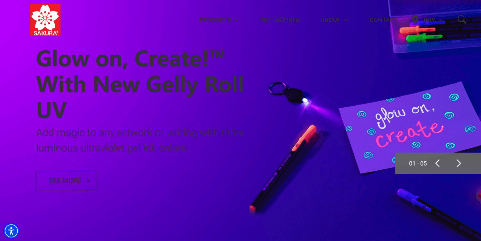
Poor Layout Leads to Frustrating Experience
The original website faced several critical layout issues that negatively impacted user experience and hindered effective information delivery. Key problems included:
Poor Color Contrast: Insufficient contrast between text and background made content difficult to read;
Limited Margins: The homepage had minimal spacing around elements, creating a cluttered appearance;
Disorganized Visual Hierarchy: The lack of a clear visual hierarchy led to confusion about which information was most important, making it hard to locate key content quickly;
Incomplete Information Display: Essential information is poorly positioned, resulting in an incomplete understanding of the brand's offerings and reducing user engagement.
Poor Contrast
Little Margin
Chaotic Hierarchy
Incomplete Info Display


... ...
BACKGROUND RESEARCH
What is SAKURA?
🌸 Brand Concept
SAKURA, established in 1921, has a rich heritage spanning over a century. The brand's name means "cherry blossoms" in Japanese, symbolizing beauty and creativity. SAKURA is dedicated to art education and produces a wide range of high-quality art supplies, including crayons, watercolors, and other artistic mediums that prioritize safety and quality.
🌸 Comparison of U.S. Site and Japan Site
The brand's online presence varies between its U.S. and Japanese sites.
The Japanese website employs a vibrant and youthful design, featuring iconic red tones and bright colors to attract very young audiences. It offers an extensive range of products, showcasing a broad and inclusive approach.
In contrast, the U.S. website presents a more minimalist design, appealing to a mature audience with a focused selection of products.
However, the shared emphasis on colorful expression remains consistent across both platforms.
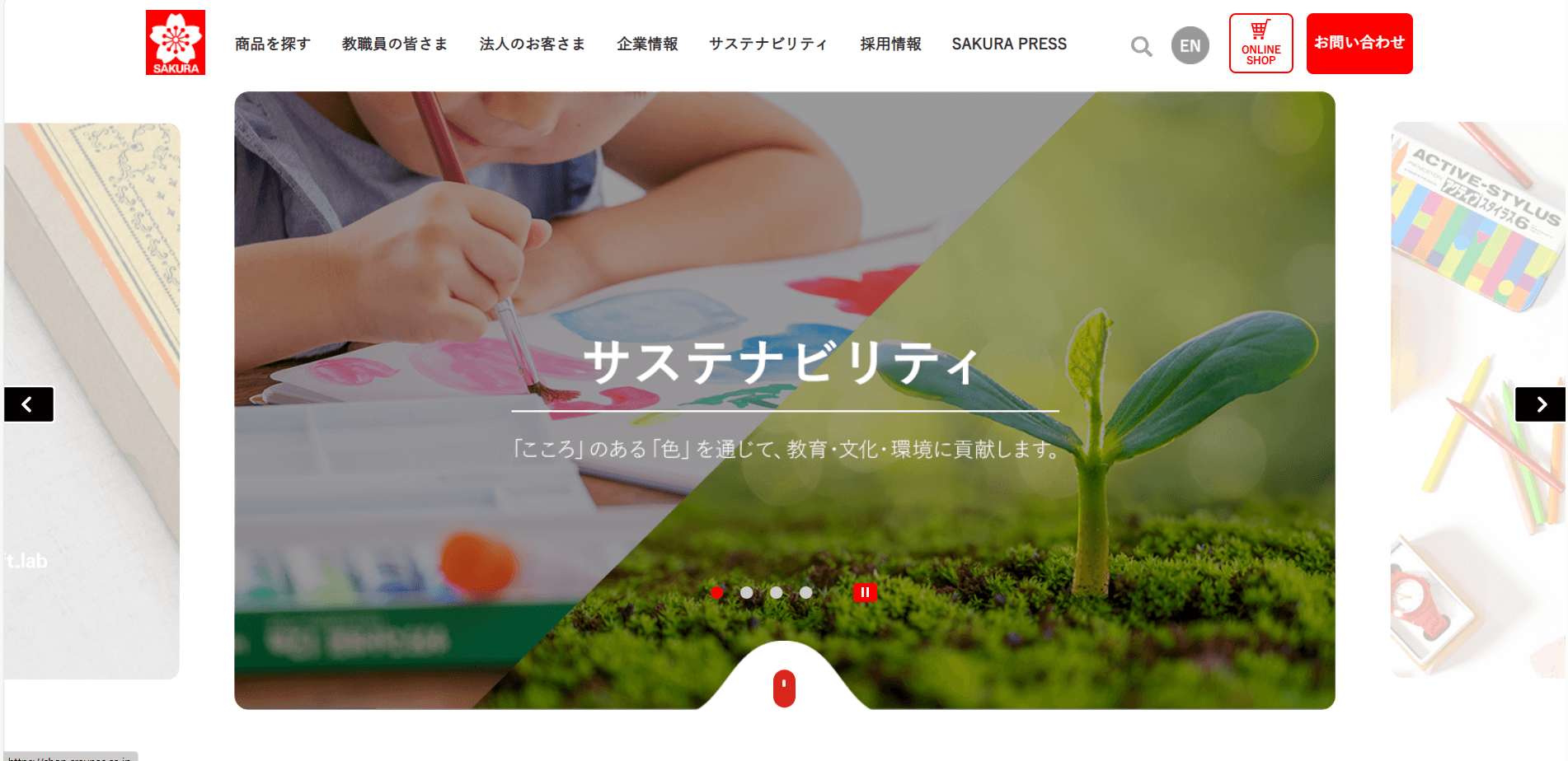

The Japan website
SITEMAP
Choosing the Scope
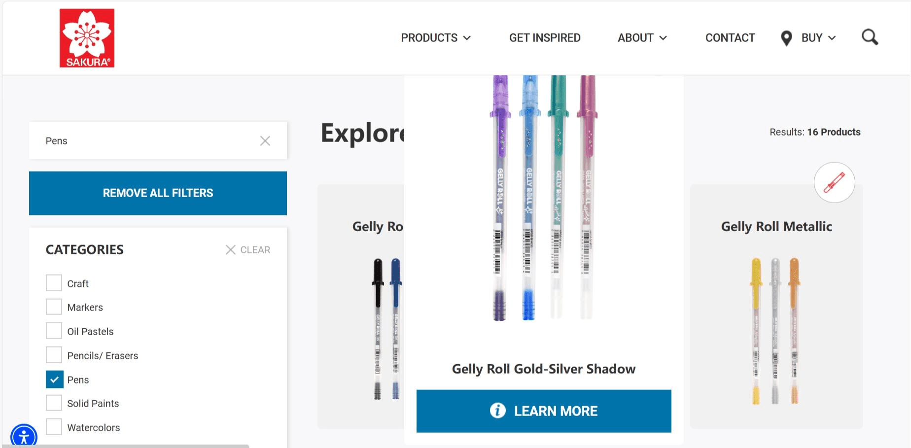
Given the limited timeframe, it was necessary to prioritize specific pages for the redesign. The homepage was chosen as a primary focus due to its importance in establishing the brand's image and creating a strong first impression for users. Since the site functions as a platform for showcasing products and facilitating purchases, redesigning product-related pages was also essential. Therefore, the scope of the redesign includes the "homepage," "product listing page," and "product detail page."

Sitemap
IDEATION
Experimenting with Design Styles
At this stage, I explored two distinct design styles to find the right visual direction for the brand:
🌸 Traditional Style UKIYOU-E
With SAKURA’s century-long history in mind, I drew inspiration from traditional Japanese ukiyo-e art. I introduced a paper-textured background and applied dark red and ink-like tones to evoke a classic and timeless aesthetic.


Homepage & Product detail page
🌸 Crayon Texture
Since SAKURA is renowned for its "Craypas" crayons, I incorporated a vibrant crayon-like texture and bright colors, with pink as the primary color to reflect the cherry blossom theme. This style emphasizes playfulness and accessibility.

Homepage & Product detail page
🌸 Refining the Design Direction
Based on feedback, the traditional style was well-received and viewed as unique, but both designs were deemed overly complex. Multiple design concepts on one page diluted the brand's impact and missed the mark in clearly targeting the right audience. Moving forward, I aimed to simplify the design and establish a more distinct and powerful brand image that resonates with the intended demographic.
WIREFRAME & DESIGN DIRECTION
Defining the Design Vision
Based on feedback, I refined the design direction to create a clearer, more cohesive brand identity for Sakura. This phase focused on building a structured layout, setting visual standards, and integrating cherry blossom motifs, capturing the brand’s vibrant yet elegant essence.
🌸 Wireframe: Building the Structure
After redefining the design direction, I started with wireframes to outline the basic structure and layout of the website. This step allowed me to prioritize elements and ensure a more smooth user experience, setting a solid foundation for communicating the brand’s message effectively.

Parts of the wireframe
🌸 Design Execution: Bringing the Brand to Life
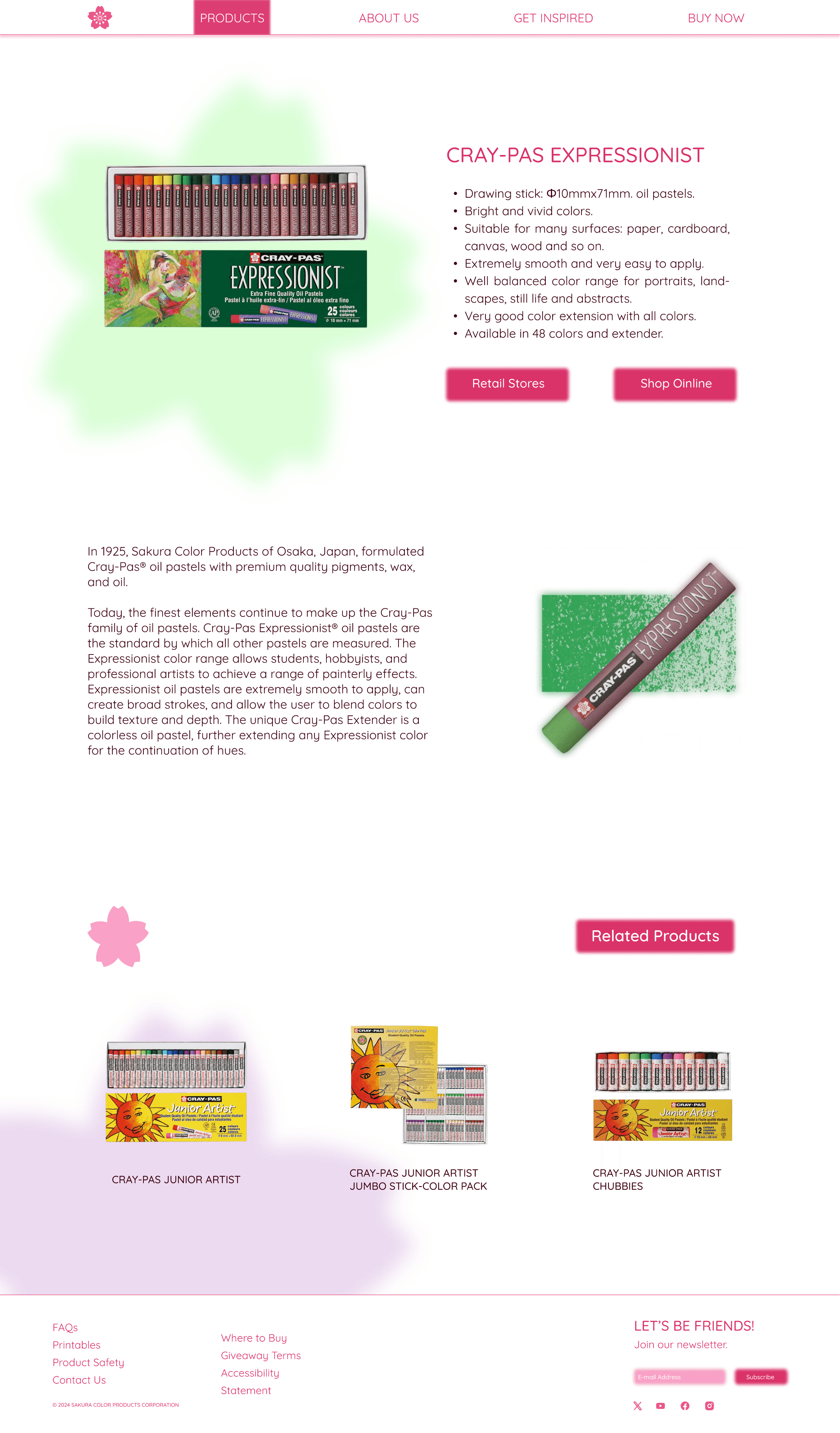
n the design phase, I applied the direction defined in the wireframes and style guide to create the final visuals. This design retained the vibrant colors from the previous concepts but prioritized simplicity and visual balance. Through the use of whitespace and cherry blossom motifs, I created a modern, brand-consistent interface that reflects the essence of Sakura. The final design is fresh, bright, and cohesive, effectively building a strong and appealing brand identity.


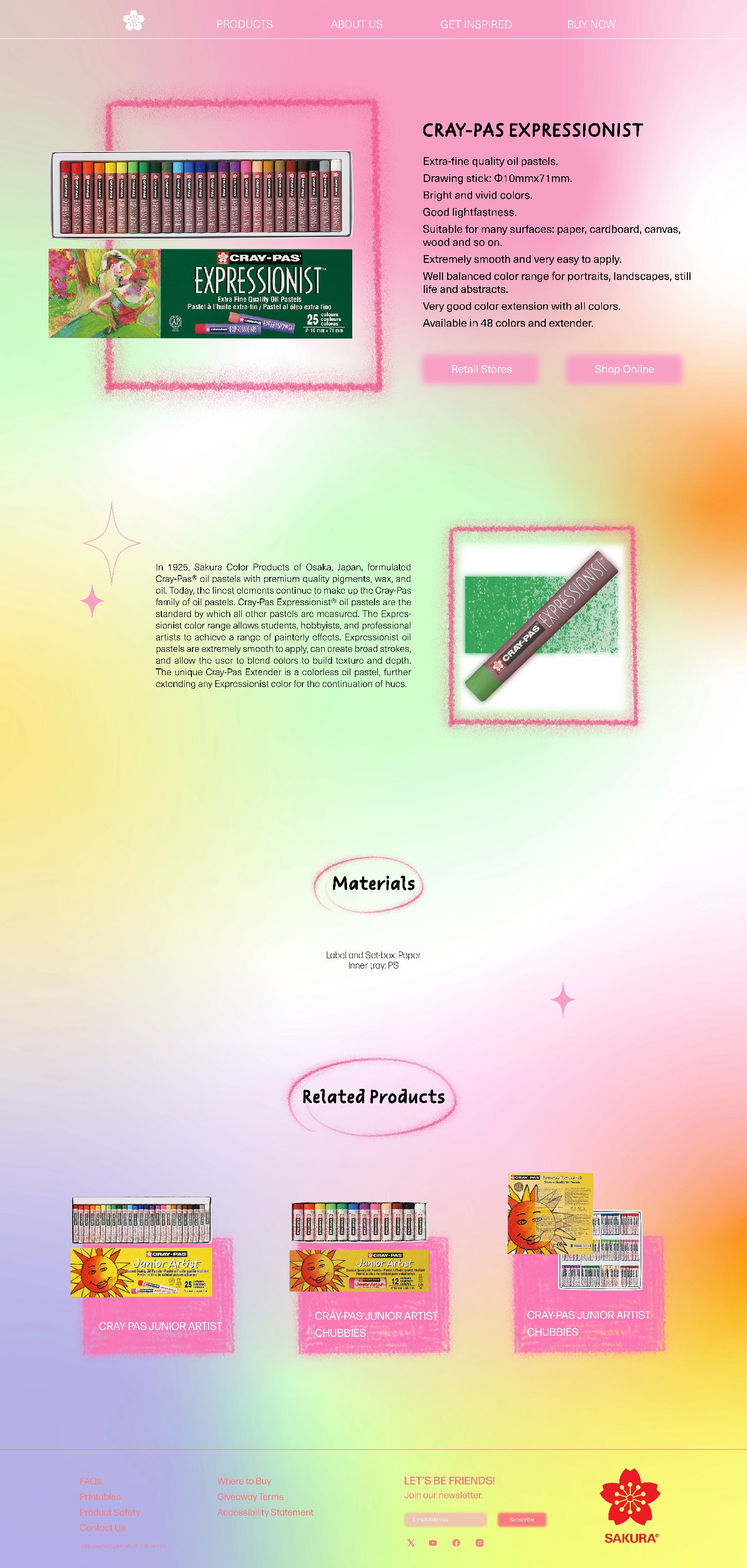
Opening page
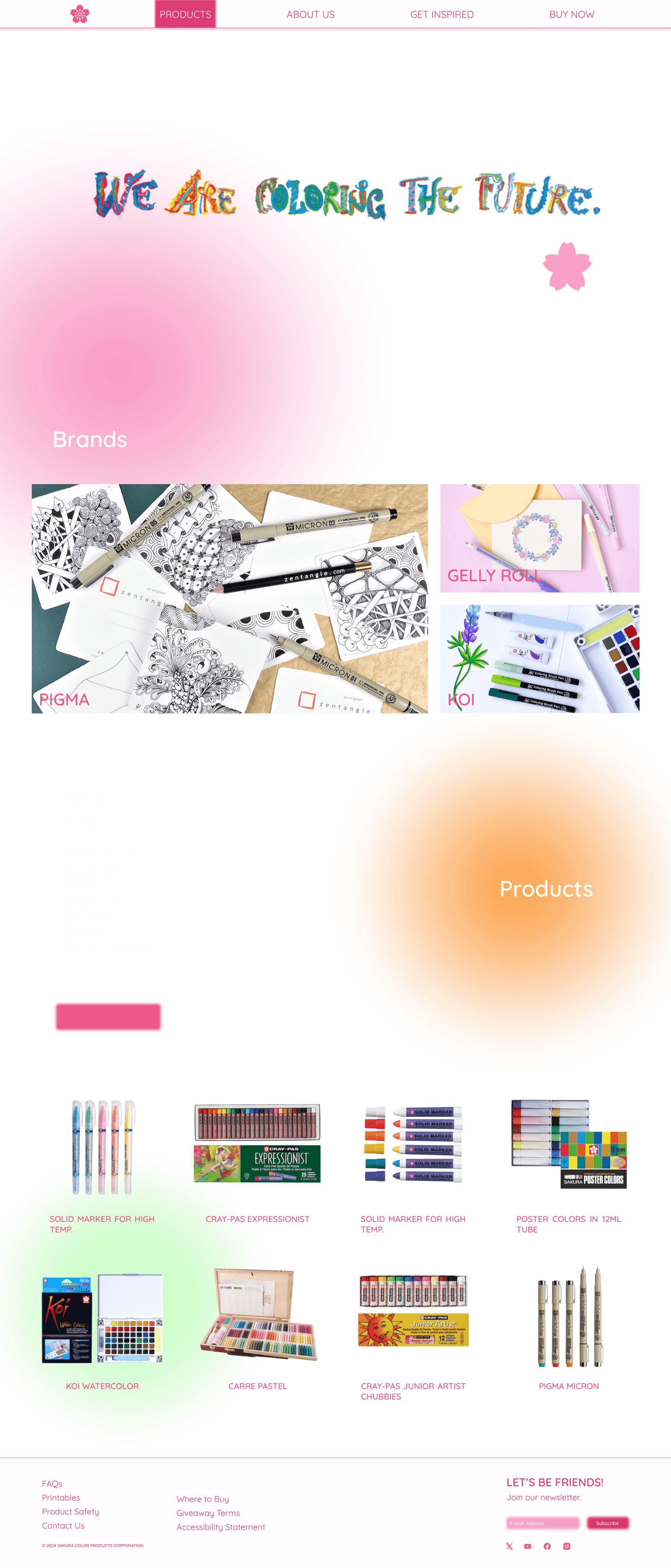
Product page

About page

Product detail page
STYLE GUIDE & FINAL DESIGN
Refining the Brand Identity
After the initial design phase, I received feedback suggesting further simplification to strengthen Sakura's brand identity and better connect with a young audience.
🌸 Style Guide: Setting Visual Standards
In the style guide, I retained light and airy tones, with cherry blossom pink as the primary color. This pink adds a youthful, vibrant feel compared to the original brand’s bold red. For typography, I kept Quicksand as the body font for readability and introduced Kari Display Pro for headings. With its rhythmic, blossoming style, Kari Display Pro brings an artistic flair that enhances the brand’s identity.
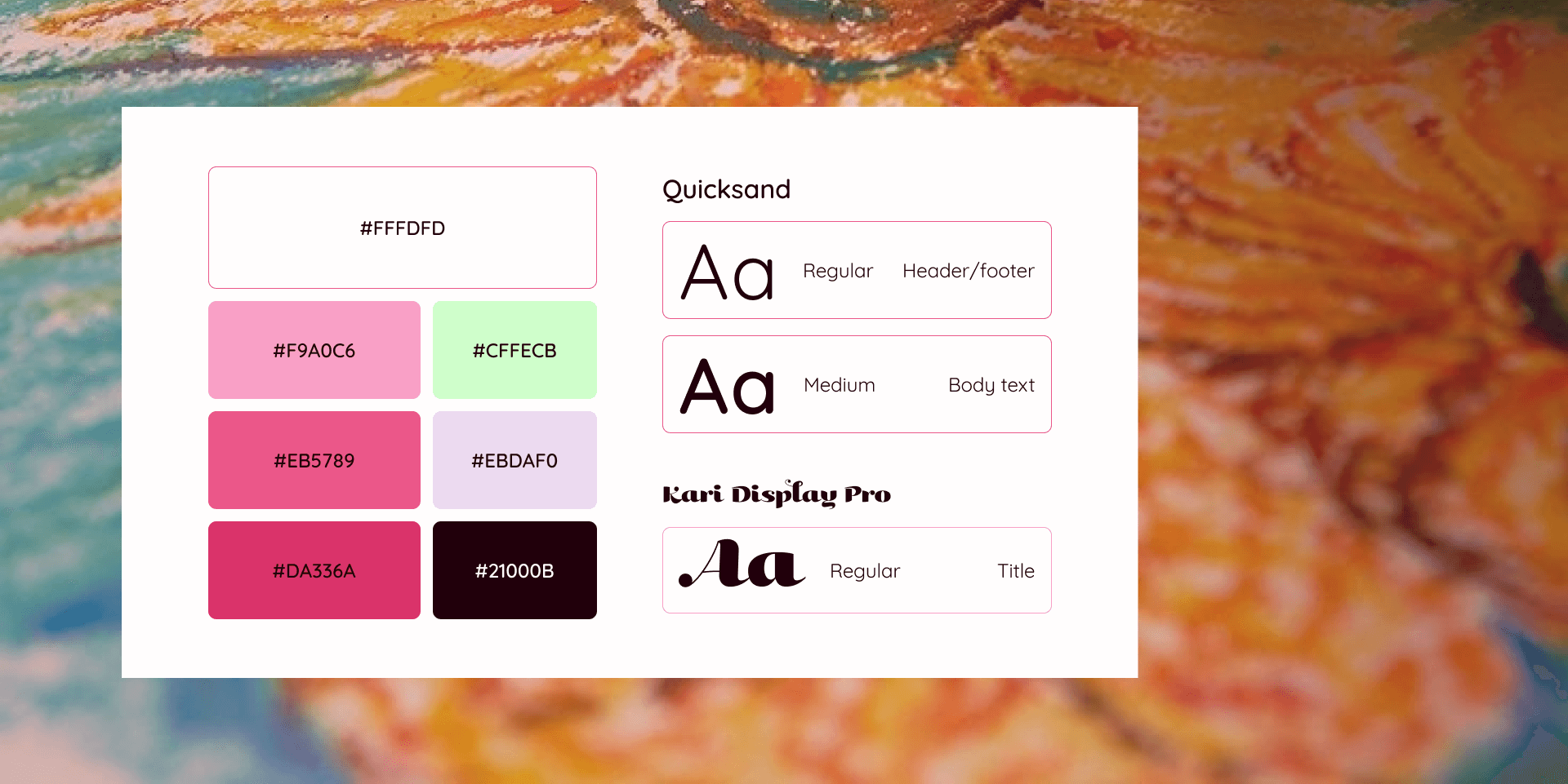
Style Guide
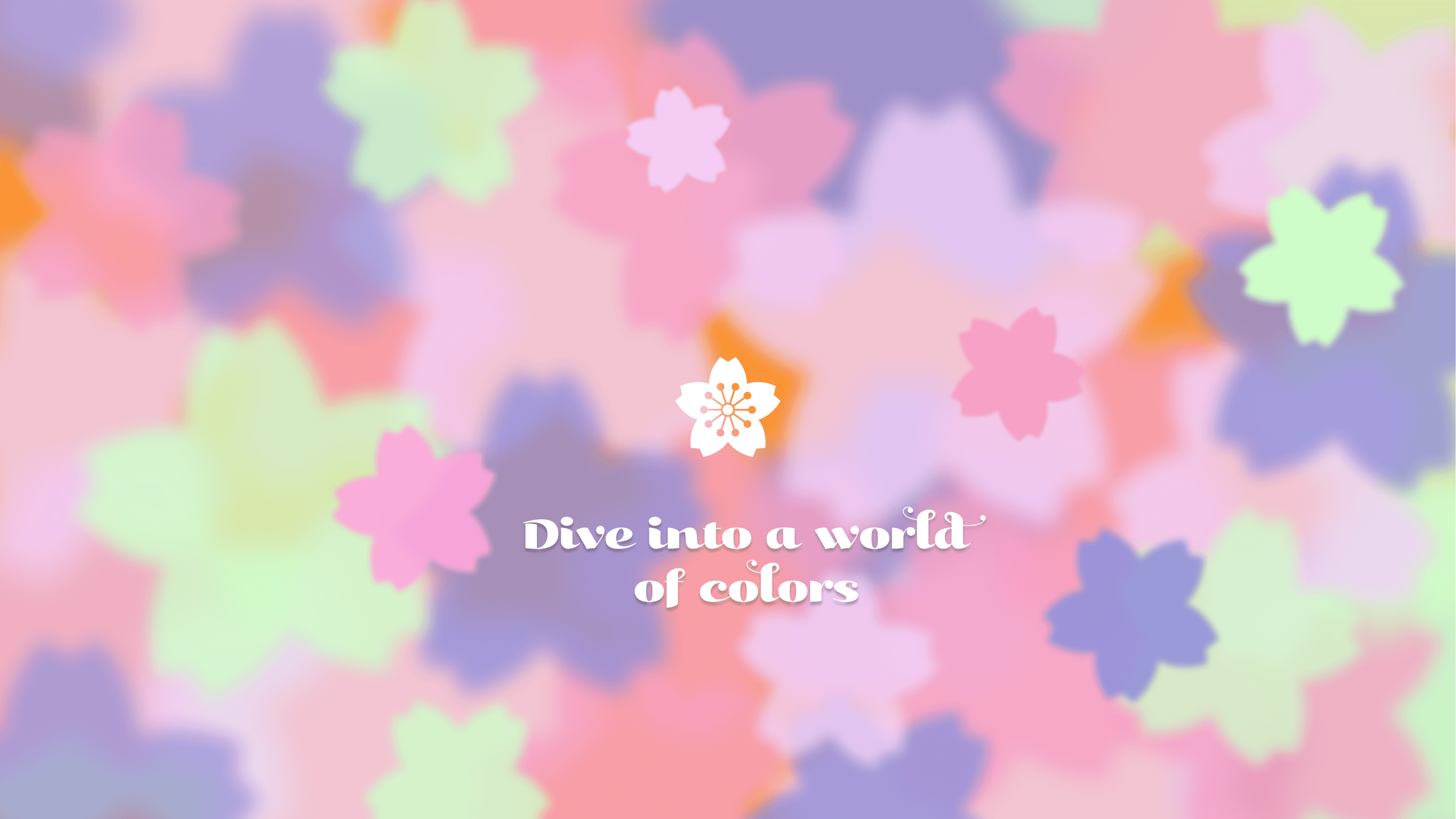
🌸 Final Design: A Cohesive and Youthful Brand Identity
I streamlined the design by concentrating on a single key element—the cherry blossom—which is central to Sakura's logo and brand identity. By reducing additional visuals and simplifying colors and layout, the design became cleaner and more cohesive. It effectively appeals to the target audience of young people, making the brand identity more distinct and engaging.


REFLEECTION
Less is More
The biggest lesson I learned from this project is the importance of “less is more.” As a designer, it’s not about making a webpage overly fancy or filling it with numerous design concepts. Sometimes, creating a powerful brand identity requires focusing on a single, well-defined concept.
Besides, this project allowed me to explore various typefaces and design approaches, deepening my understanding of visual design. It also enhanced my skills in branding and taught me how to align design choices to effectively resonate with the target audience.