

TEAM
1 Product Manager
2 Researchers
1 UX Designer (me)
1 Engineer
my Responsibilities
UX flow & interaction design
UI design & visual direction
Design system creation
Prototyping & micro-interaction
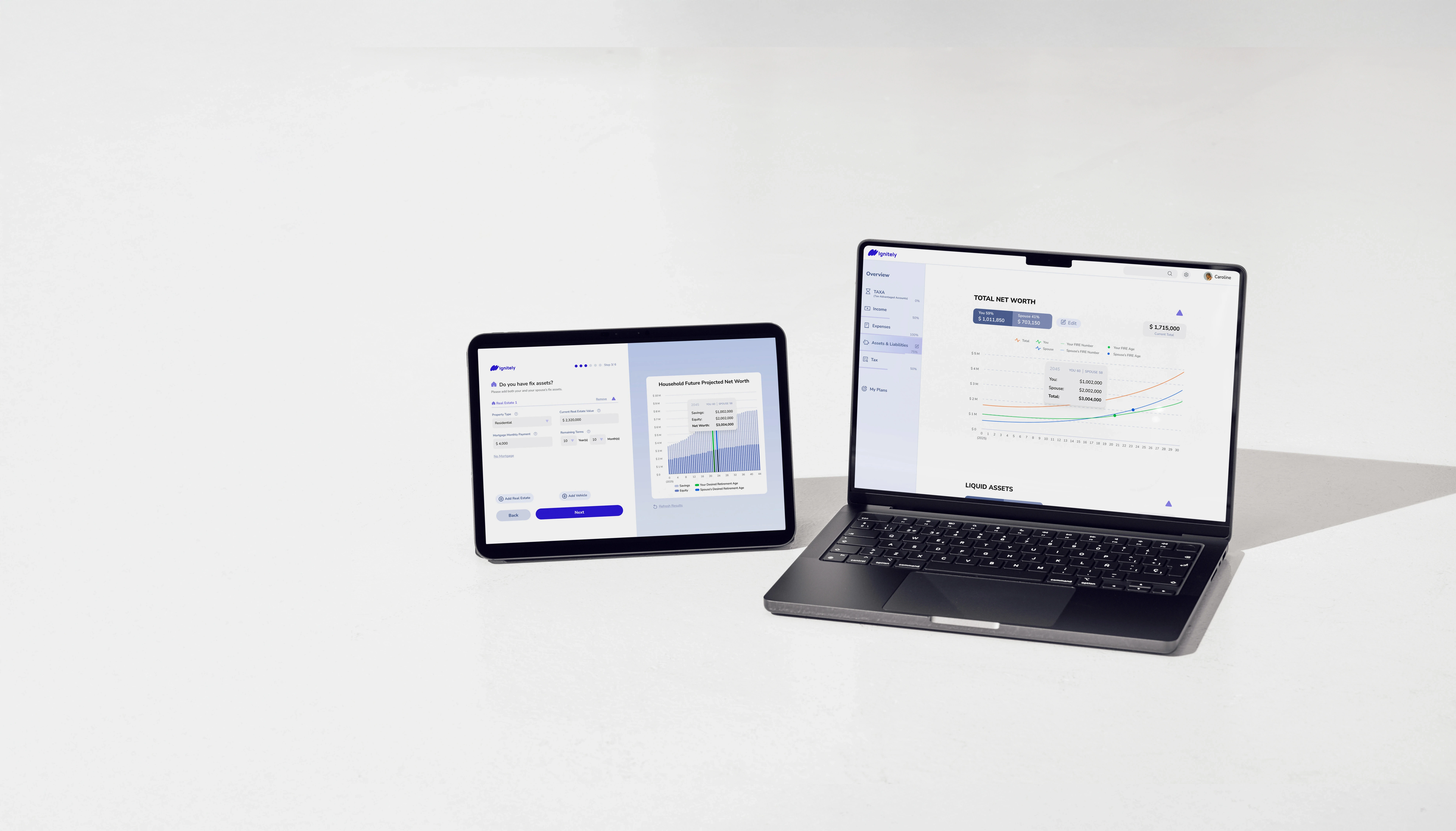
OVERVIEW
It's an early-stage financial planning tool designed to help users visualize and plan for FIRE (Financial Independence, Retire Early). As the sole designer on the team, I led the product design from 0 to 1, including UX strategy, UI design, interaction flows, and data visualization.
This case study focuses on improving the overall data input experience across the product. I redesigned both the onboarding flow and the main interface to make data entry more streamlined, visual, and engaging — reducing friction, enhancing real-time feedback, and strengthening the connection between user input and financial projections.
Disclaimer: This project is still under active development. The designs shown here are conceptual and do not represent the final shipped product.
PROBLEM STATEMENT
“
The user experience was hindered by overly complex data input processes, insufficient timely feedback, and a lack of intuitive interaction between users and their data, all of which contributed to a high drop-off rate and reduced user engagement.
”
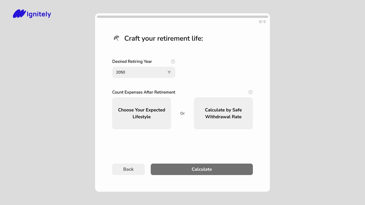
Scenario 1
Onboarding
Previous Design of Onboarding pages
Only text data inputs without timely feedback results in high drop off rate
Step 1

…
Step 5
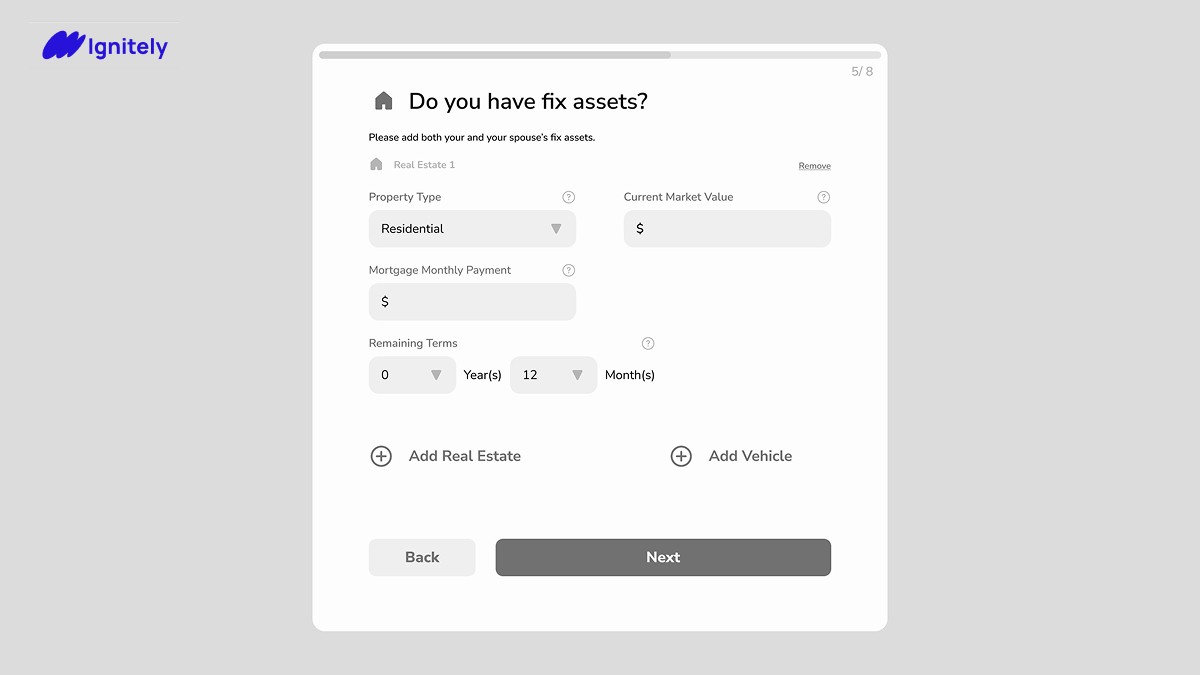
…
Step 8
Scenario 2
Main Page
The vertically aligned charts and editable information make the page too long, hindering efficient interaction. Users struggle to find and edit information, and cannot see chart updates without scrolling back up.

Design Approach & DECISIONS
Design Decisions Led by Cross-Functional Collaboration and Competitor Analysis
Based on research insights that reduced required user input, I restructured the onboarding flow and consolidated data fields to streamline the experience. I also redesigned the main page layout in response to engineering needs, separating data entry into modals for a cleaner, more modular interface. Researchers and engineers supported input reduction and technical feasibility, while the PM ensured alignment with product goals.
Competitive Analysis
I led the design process by analyzing competitors like ProjectionLab and Boldin to identify effective patterns and pain points.
* Boldin *
What they do well:


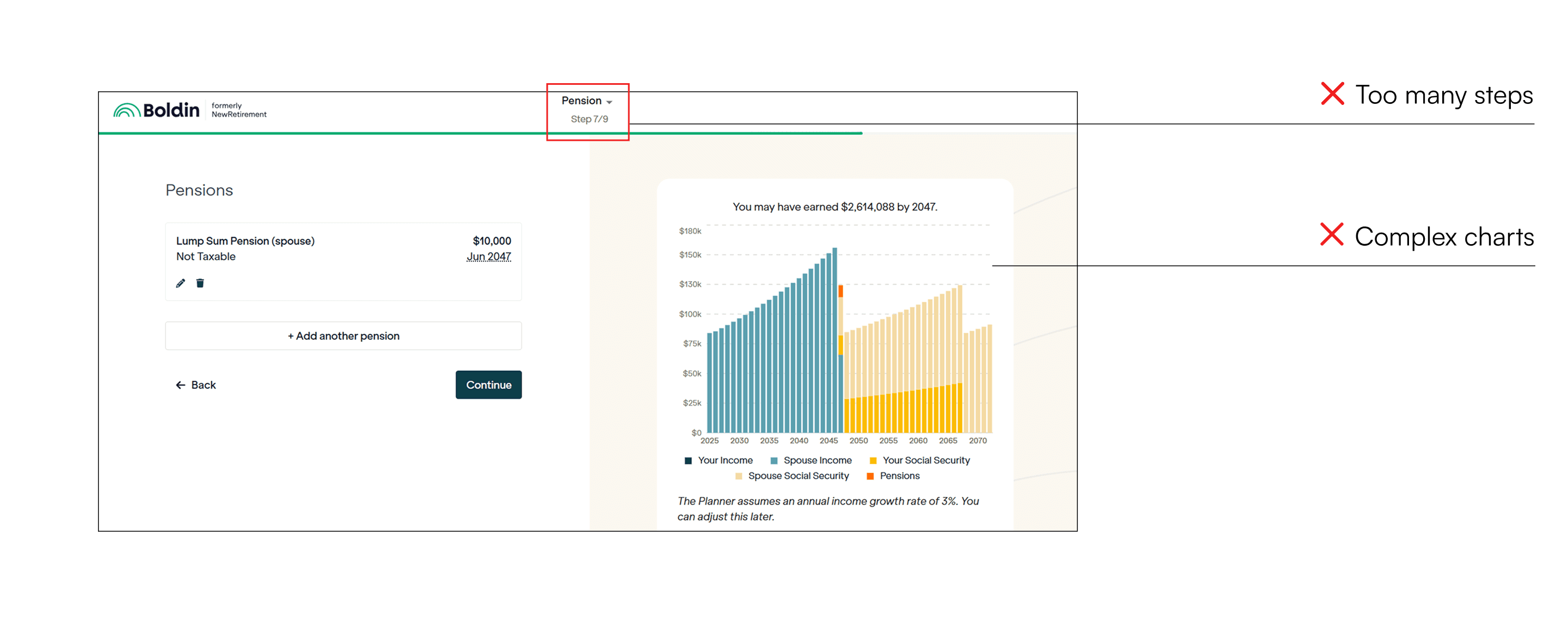


Where they fall short:
The solution
Simplifying Data Entry and Improving Visual Feedback for a More Streamlined User Experience
Scenario 1 - Onboarding
Adding interactive visuals and timely feedback
Before users put in any data and info:
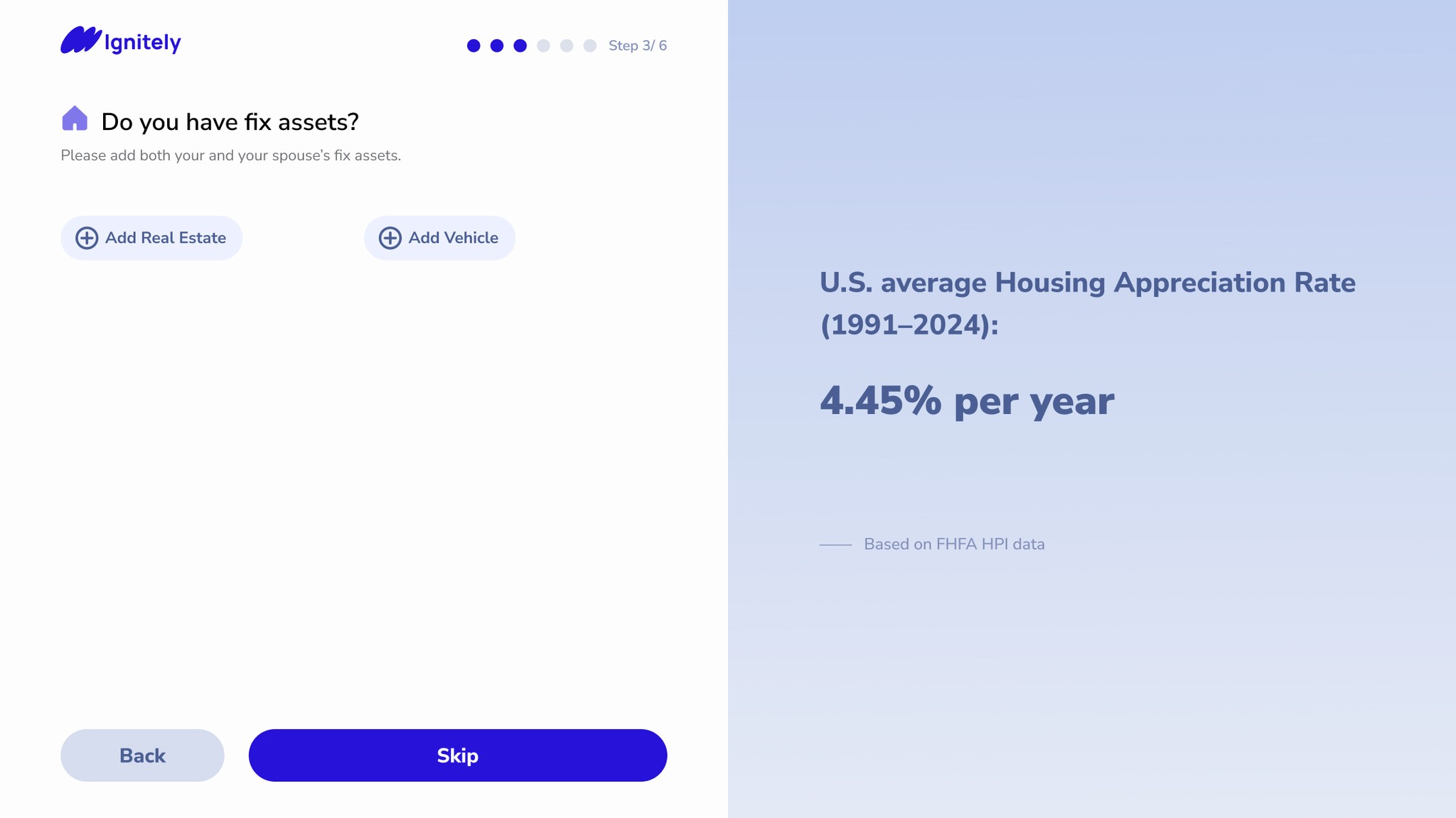
Showing related research testimonial

After users put in data and info:
Showing projected net worth chart
(updated timely when any info is changed)
Simplifying 8 steps into 6 steps by reorganizing data input fields
Step 1

Step 2

…
Step 6

Scenario 2 - Main Page
Separating data input and graphic charts

Only shows graphs on the page main view
Moving editable information into pop-up windows

Use the scroll bar to see more ↓↓↓


Preliminary Impact
Simplifying Data Entry and Improving Visual Feedback for a More Streamlined User Experience
Although the product has not yet launched and formal user testing is still pending, internal reviews from the product and engineering teams have been very positive.
• The updated onboarding flow has been described as “much more intuitive and motivating”.
• The simplified layout on the main page greatly improved developer handoff and clarified data-to-graph relationships.
• Engineers reported higher design clarity and modularity for implementation.
* Formal usability testing will be conducted after implementation to validate assumptions and measure impact on completion rates and engagement (Interaction Events, Information Completion Rate, etc.).